Cabinet refacing is one of the most popular ways homeowners refresh their kitchens, bathrooms, and built-in storage without a full remodel, and color choice plays a huge role in how dramatic the transformation feels. While classic whites and woods will always have their place, today’s color trends are all about personality, contrast, balance, and a sense of timeless style that still feels modern. With influences from interior design, fashion, and even social media, cabinet colors have begun to lean into expressive yet practical tones that bring life to everyday spaces. Whether you’re thinking about selling your home or just love a fresh look, choosing the right color during refacing can instantly elevate your space, create depth, and make cabinets feel like high-end custom builds—not just a refresh.
Color trends shift with lifestyle priorities, and right now, homeowners want options that are calming, bold, and comfortable. From grounded neutrals that hide everyday wear to dramatic hues that make a signature statement, this evolution reflects the way we live and connect with our homes. Homeowners are also more confident experimenting with color combinations—blending two or more shades within a single kitchen or even mixing finishes to create visual interest. And as ideas spread rapidly online, trends evolve faster than ever, shaping what designers are calling “the new classics.” This guide explores the top colors taking over cabinet refacing and why they’ve become so popular among homeowners and designers alike.
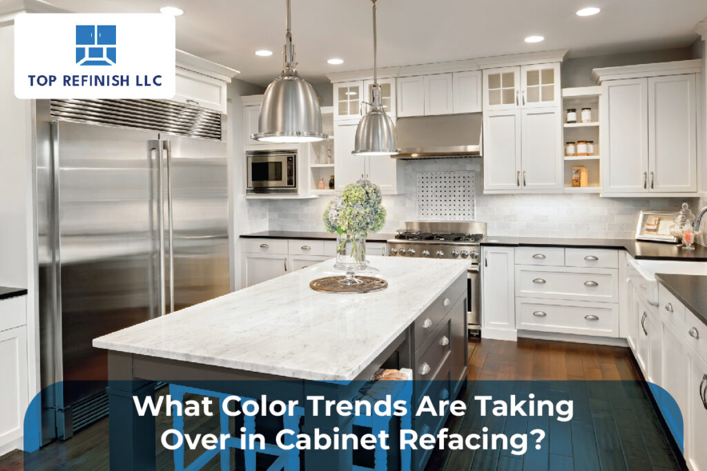
Classic Whites with Warm Undertones
White cabinets have long been a kitchen favorite because they make spaces feel open, bright, and inviting. But the trend right now isn’t just stark, cool white—it’s warm white with creamy, soft undertones that feel more sophisticated and less clinical. Shades like antique white, cream, and soft vanilla are dominating cabinet refacing because they pair beautifully with natural wood accents, warm metals like brass or gold, and a wide array of countertop materials.
These warm whites provide a backdrop that feels cozy yet contemporary, striking a balance between brightness and comfort. Unlike pure white, which can show smudges and fingerprints more easily, warm white tones tend to hide everyday wear better. In addition, they work well with farmhouse, transitional, and classic designs, giving homeowners flexibility if they plan to sell in the future. It’s like choosing a calm foundation before adding layers of personality—and that’s why warm whites are enduring the trend cycle rather than fading away.
Moody and Dramatic Blues
Blues have become a go-to for homeowners who want a color that feels deep and expressive without overwhelming the space. Unlike loud colors that can feel trendy and fleeting, moody blues like navy, midnight blue, and deep teal offer richness and sophistication. These tones are especially popular on lower cabinets or kitchen islands, where they ground the space and contrast beautifully with lighter walls or countertops.
Bluish tones also evoke a sense of calm and stability, which design experts say resonates with today’s desire for sanctuary-like interiors. Deep blues pair well with matte black hardware, warm wood elements, or even brass finishes, giving a layered and curated look. Using blue strategically—for example, on an island while keeping upper cabinets neutral—creates visual interest without making the room feel too dark. This trend is rooted in the idea that color doesn’t have to shout to make a statement; sometimes the best designs whisper in rich, inviting tones.
Earthy Greens and Warm Naturals
Green is everywhere in cabinet refacing right now, especially shades that mimic nature—from sage and olive to moss and forest green. These earthy greens create an organic feel that blends seamlessly with natural stone, wood accents, and indoor plants. Instead of feeling bright or neon, the trending greens have depth and warmth that make spaces feel grounded and serene.
Homeowners and designers love these tones because they connect interior spaces with nature without the look feeling overly rustic. Earthy greens work with both traditional and modern aesthetics, moving beyond the “country kitchen” stereotype to something that feels refined and modern. Pairing these greens with natural wood leather finishes or matte black hardware creates a balanced contrast that elevates the overall design while keeping it rooted in nature.
Warm Gray and Taupe Bases
Gray has been a popular color for years, but the new trend favors warmer grays and taupe-based hues over cool, bluish grays. These warmer neutrals feel more inviting and complement a wider range of countertop, backsplash, and flooring options. Homeowners who want neutral cabinets that still offer visual depth find these tones especially appealing.
The beauty of warm gray or taupe is that it doesn’t clash with wood tones or warmer metals. It offers a cohesive look that works well in open-concept spaces, transitional homes, and contemporary designs that demand neutrality without feeling too flat. These colors also adapt well to different lighting conditions, avoiding the sometimes harsh or sterile feel that cooler grays can create under certain light.
Bold Contrasts with Black and Charcoal
Dark cabinets are no longer just for ultra-modern or industrial kitchens—they’re becoming a major trend in cabinet refacing across many styles. Black and charcoal cabinets create a dramatic, high-impact look that makes lighter counters and backsplashes pop. When used in the right proportion, dark cabinetry adds dimension and sophistication, especially in large kitchens or as accent sections like islands or lower runs.
The trick with black or very dark cabinetry is balance. Designers often pair them with lighter walls, metallic accents, or open shelving to keep the space from feeling too heavy. Dark tones also feel timeless when executed with matte or soft satin finishes, avoiding overly glossy surfaces that can show fingerprints. This trend allows homeowners to experiment with contrast in a way that feels luxurious without being trendy for trend’s sake.
Two-Tone Cabinet Schemes
One of the most exciting trends in cabinet refacing is the use of two complementary colors in the same kitchen. This approach creates depth, structure, and personality without overwhelming the space. A very popular variation includes a more neutral shade on upper cabinets paired with a stronger, richer color on lower cabinets or the island.
For example, warm whites or soft neutrals on top paired with moody blues or deep greens below create contrast that feels curated rather than chaotic. This trend works especially well in open-concept homes where the kitchen is visible from the living areas. Two-tone schemes allow homeowners to express personality while keeping the overall aesthetic cohesive and balanced. It’s a modern take on color that feels intentional and tailored.
Soft Pastels and Muted Tones
While dramatic colors and strong contrasts are trending, many designers also love soft, muted pastel shades for certain spaces. Colors like blush beige, dusty rose, or muted aqua give cabinets a subtle hint of personality without overpowering the room. These softer colors are especially popular in smaller kitchens or bathrooms where a bold color might feel too intense.
Pastel and muted tones contribute to an airy, calm atmosphere. They pair beautifully with light wood accents and natural stone, making spaces feel bright and fresh. These colors are a way for homeowners to move beyond basic neutrals without committing to a bold hue—an ideal option for those seeking understated uniqueness.
Wrap-Up
Cabinet refacing colors are evolving beyond the traditional basics, giving homeowners more ways to express both timeless style and contemporary flair. Warm whites, moody blues, earthy greens, warm gray neutrals, dramatic blacks, two-tone schemes, and soft pastels are all gaining popularity because they offer a balance between bold design and everyday practicality. These trends reflect a broader shift toward spaces that are both aesthetically pleasing and emotionally comforting, allowing kitchens and bathrooms to feel more personal and intentional. Whether your goal is modern elegance, natural warmth, or expressive contrast, the current wave of color trends in cabinet refacing ensures there’s a palette suited to every taste and lifestyle. Choosing the right color not only updates the look of your home but also increases visual appeal, resale value, and long-term satisfaction with your space.
FAQs
1. What color trend works best for resale value?
Neutral tones like warm whites, warm grays, and earthy greens tend to appeal to more buyers because they feel timeless and versatile.
2. Are dark cabinets harder to maintain?
Dark finishes can show dust or fingerprints more easily, but matte or satin finishes help minimize visible marks while creating a sophisticated look.
3. Can I mix more than two cabinet colors?
Yes, but it’s best done when there’s a clear visual balance, such as one primary color with two subtle accent tones for smaller areas.
4. How should I choose a cabinet color for a small kitchen?
Lighter hues, soft pastels, or a balanced two-tone scheme can make smaller spaces feel brighter and larger.